


In an unusual clash of design and motorsport branding, Revolut — the fintech company and title sponsor of the upcoming **Audi F1 team — has openly criticised Ferrari’s new Formula 1 livery, calling it a major branding misstep. The comments, made by Revolut’s chief marketing officer Antoine Le Nel on the Business of Sport podcast, have stirred conversations not just about car aesthetics but also how major sponsors should visually complement team identities in F1.
Ferrari’s latest car features a bold blue logo from its title sponsor hp (Hewlett‑Packard) placed prominently against the team’s traditional racing red. While ferrari has embraced the partnership — integrating HP’s branding into its design as part of a multi‑year sponsorship — the visual contrast has proved divisive. Le Nel didn’t mince words, saying that brand identity matters deeply and that the blue on red “is not good” from a design standpoint. His remarks plainly questioned the aesthetic harmony between Ferrari’s heritage colour and the corporate colours of its main partner, sparking debate among fans and marketing experts alike.
Revolut contrasted Ferrari’s approach with what it views as better branding alignment from teams like McLaren with Mastercard and Google Chrome’s innovative use of wheel graphics, praising their integration as clean and effective. Le Nel’s comments highlight how sponsors in modern Formula 1 seek not just visibility but cohesion with a team’s visual identity — something he feels Ferrari’s design fails to achieve.
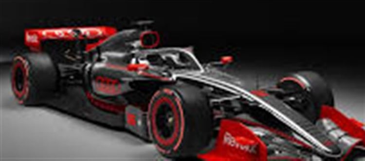
The remarks carry extra weight this year because Revolut is not just any sponsor — it’s the title partner of the new audi F1 team set to debut in 2026. The partnership reflects Revolut’s wider strategy to associate its brand with innovation, performance and disruption — values shared with audi as it builds its F1 programme from the ground up. Le Nel explained that this alignment felt “natural,” contrasting Audi’s in‑house development philosophy with rivals that outsource key components.
The controversy also underscores how sponsor visibility and aesthetic decisions play into broader commercial objectives in Formula 1. With massive global audiences and intense media exposure, how a team’s livery represents both its own identity and those of its partners can influence perceptions among fans, media and prospective sponsors. Debates about the ferrari livery show that even longstanding traditions like Rosso Corsa — Ferrari’s iconic red — aren’t immune to scrutiny when corporate branding elements alter a team’s classic look.
Ferrari’s decision to feature HP’s blue logo may simply be a strategic sponsorship choice, but the backlash — amplified by Revolut’s influential platform — illuminates a deeper tension in high‑profile sports: balancing heritage aesthetics with sponsor demands. Whether ferrari will rethink its design approach in future seasons remains to be seen, but the controversy highlights that even subtle livery choices can spark passionate debate in the world of Formula 1.
Disclaimer:
The views and opinions expressed in this article are those of the author and do not necessarily reflect the official policy or position of any agency, organization, employer, or company. All information provided is for general informational purposes only. While every effort has been made to ensure accuracy, we make no representations or warranties of any kind, express or implied, about the completeness, reliability, or suitability of the information contained herein. Readers are advised to verify facts and seek professional advice where necessary. Any reliance placed on such information is strictly at the reader’s own risk.
 click and follow Indiaherald WhatsApp channel